BECU Brand
BECU, founded in 1935 by 18 Boeing employees, has grown into the largest credit union in Washington and the fifth largest nationwide, serving over 1.4 million members.
Rooted in community and powered by the passion of its members and employees, BECU exemplifies what’s possible when people come first. At a time when trust in financial institutions is declining, BECU remains a beacon of integrity and member-focused values. As a Design Director, I contributed to the effort to modernize their identity, delivering a fresh, distinctive look that seamlessly adapts across environments while reinforcing their mission to empower and support their members.
Agency: Phinney Bischoff
Role: Design Director & Designer
Original LogoWe designed a modern, approachable, and flexible identity for BECU, ensuring it supports their continued growth across digital and physical environments. The updated logo reflects BECU’s evolution from serving Boeing employees exclusively to becoming a trusted financial institution for a broader community. The iconic scripted “E,” originally highlighting Boeing employees, was adjusted for balance, giving equal emphasis to all letters while honoring the credit union’s roots. The signature red and the familiar logo shape remain, maintaining a connection to BECU’s heritage. This refreshed identity positions the brand to stand out in an increasingly competitive landscape. It has been a privilege to contribute to BECU’s growth over nearly 2 decades, and I look forward to seeing its impact expand across Puget Sound and beyond.


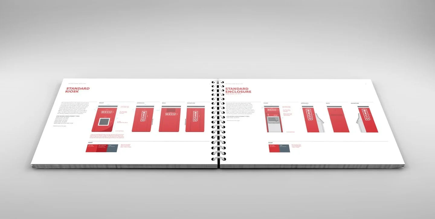
To complete the identity, we created a visual language featuring an expanded color palette, updated typography, a versatile icon library, and a custom illustration style that reflects BECU’s warmth and approachability. We also explored sample applications to ensure flexibility and seamless use across various touchpoints.